Friday 11 March 2011

Flyers around town.

Here I have also gathered some examples of where you can find band/gig flyers in daily life.

This image shows a man using 'gurilla' advertising
to attract attention while handing out flyers.
Handing out flyers to passers by is the common
way to attract publicity quickly and easily.

Flyers can also be placed in shops and cafes ect.. this gives the public a decision to view the flyer rather than being passed one while walking or busy doing something.

Posters around town.

Here I have gathered various posters to show examples of where they can be noticed and recognised by the passing public. The posters displayed below are all posters designed for musicians/bands/events/nightclubs ect.. As many posters like this are commonly displayed in groups the designs need to be powerful and eye-catching to stand out from the surrounding posters. The common sizes for these posters are A3 and A2, as these are quite large paper sizes it adds to the colour impact of the design.


Monday 7 March 2011

Poster design.

A poster is a piece of printed paper designed to advertise and promote a subject. I will be looking specifically into music poster art from the past and present. This type of poster needs to be eye-catching and  be able to easily convey information. The main features of a music poster are; A title - which usually is the musicians name or event title. A sub-heading/slogan - This could relate to the band or song title. Imagery/graphics - This is the main feature of a poster as it attracts attention and separates posters from each other. The design of a poster commonly relates to the genre, audience or a specific message. For example; A poster created for a dance music genre would be brightly coloured and fun looking to attract the attention of the target audience which is usually young students.


The 1960's is where poster art really became popular, the designers were able to excel design restraints to create something unusual and unique. The colours of this time were extremely bright and psychedelic which represents the drug use and 'highs' of this era.
In the 1970's poster art was also extremely creative and handmade. Most posters were black and white or two simple colours to save on printing costs. The style of this time was punk, as so the poster designs were extremely aggressive looking and hand drawn.
In more recent times designers have experimented with various design techniques which include typography and digital manipulation as well as the traditional hand-rendered illustrations and collages.


I plan to be creative with my poster designs and use various techniques to create them. Collage being one of my main ideas. I also plan to keep my designs quite neutral coloured wit a grungy style.


http://www.gigposters.com/
The website above gives many examples of exsisting poster art. The posters are all very creative and attractive. I love the retro styled posters which use mixed media. The colours are well thought out. (Example below).

Inspiration.

Below I have gathered together a few photographs I like which I may re-create in my photo shoot.

I love the way the surroundings are blurred in this
image to focus upon the subject in the distance. 
This image works well as the model's clothing clashes with the
blueness of the sky. I like the angle of the shot as it makes the
model look larger than she actually is.
I love the way this image focuses on one person, I could easily
re-create this image with James and Emma.
I love the dramatic style of this photo,  I also like how the
photographer has focused on the background as well as the model.

Sunday 6 March 2011

Photography in magazines.


Photography in Poster art.

Kasabian - Merchendise.
The Wanted - Merchandise
Chase & Status - Advertisement
The Kooks - Advertisement

Photography in Album Art.

The rolling stones - Let it be - 1968

The Beatles - Let it be -1970

U2 - War - 1983


Oasis - Definitely Maybe - 1994

Spice Girls - Forever -2000


Rihanna - Loud - 2010

Gered Mankowitz - Photographs.


Gered Mankowitz.

http://www.mankowitz.com/


Gered Mankowitz is a English photographer born on 3rd August 1946. After leaving school at the age of 15 and not really gaining any formal qualifications Gered took on a hobby of photography which he discovered during a school trip to Holland. His photographs were noticed by a famous photographer named 'Tom Blau' and as of this he offered Gered an apprenticeship with his famous photography agency named 'Camera press Ltd' based in London. Over a period of several months Gered worked in all the various departments that made up 'Camera Press' which gave him a great knowledge of the industry and encouraged him to progress further. He gained a job with 'Camara Press' and immediately began working professionally on assignments based in and around London.


In 1962 Gered went over to Barbados with his family and began working over there. He took a range of photographs for various people and companies such as a lead architect in the country and British West Indian Airways. When Gered finally returned back to England he was offered to visit Paris to work with a fashion photographer, but Gered was not drawn to this despite of the exciting and glamourous atmosphere as he felt as that particular area of work was not for him. Instead he began to work with a 'show-biz' photographer named 'Jeff Vickers'. He focused upon various theatre productions which made him the youngest photographer to have taken this kind of photos, so while working for Jeff Vickers he was given the chance to develop his 'show-biz' contracts and broaden his experience in the studio taking portraits of many actors and other personalities.


From this moment on Gered became know in the photography world has he began photographing musicians and became focused on this industry just at the time it needed new, mould breaking images. At the end of 1963 Gered opened his first studio in London. It was close to popular 'hangouts' of the celebrities of that time and also close to where John Lennon met Yoko Ono.


In early 1965 Gered was asked to photograph 'The rolling stones' this was a major turning point in Gered career because of a result from photographing the rolling stones he was asked to travel America with the band on their record-breaking 1965 Autumn tour. Gered took photos of them none stop for around 9 weeks and began producing album covers for their songs as well as taking photos for press and publicity, home, studio and on stage photographs. This unfortunately stopped when the band broke off from their manager in 1967.


Throughout the 1960's Gered photographed many famous stars such as 'Jimi Hendrix', 'The yardbirds' and 'Softmachine'. In the 1970's Gered began working with other names such as 'Slade', 'Gary Glitter', 'Elton John', 'Kate Bush', 'Duran Duran' and many others. At this time Gered was also asked to photograph on the set of new films to create 'stills' for advertising needs.


For over 22 years Gered was based at his North London studio taking prize-winning photographs for the advertising industry. He still works in the music business photographing band and singers for album covers and magazines. He contributes regulary to the Sunday Times Magazine and Mojo magazine as weel as shooting sessions with musical artists such as 'Oasis', 'The Verve', 'Embrace', 'Snow Patrol' and many others.


Prints of Gered's work are purchased in galleries thoughout the world including London, Manchester, Glasgow, Berlin, Amsterdam, New York, Washington DC, Los Angeles, San Fransisco, Hawaii, Hong Kong, Dubai and Tokyo.


More recently Gered has had features in galleries such as 'The National Portrait Gallery' in London.
Gered has also teamed up with the legendary Beatles photographer, 'Robert Freeman' and presented a 64 image show in Hong kong which was huge success as of that the show travelled all over the world.


From 2007 to date it is known that Gered moved to Cornwall and spends most of his time working on his own projects and teaching at the University College Falmouth.

Photography in music.

Photography is a huge element of any graphic design piece, especially in the music business.
Photography is used to attract the audience to the band members to get them recognised. Imagery is used in all designs such as posters, flyers, album art as well as all the extras such as t'shirts and in magazines. To show examples of this I have researched a couple of photographers based upon musicians and celebrities.
In addition to this I have also gathered various album art and posters to show poses and techniques photographers use to promote a specific band/artist.

Logo's in design.

Logo's have to be suitable for any size, colour and product as of this they are usually simple but still eye-catching. I have researched various band merchandise to show examples of where logos are used within the music industry.
Bags.


Hats.


Album art.
Posters.

Musician logo links.

http://www.rockbandlogo.com/band_logo.html This link is to a company specialising in rock band logo design. It has a design portfolios of existing musicians logos they have created.


I have found recent musicians logo's by searching on google images.
Examples:


Oasis.

The Kooks.


Jessie J.


Take That.

www.logodesignguru.com

http://www.logodesignguru.com/Logo-design-portfolio/portfolio.asp?page=1&cat_id=33&tab=1#port


The link above is to a website that gives various examples of music based logos. These are mostly designed for music companies and record labels. I have placed a couple of examples below.


www.thedesigninspiration.com

Whilst browsing for logo examples I came across this helpful website. It displays design work from all over the globe with categories such as logo design, illustration art and creative photography.

I particularly like this logo design as it creatively combines the client's company name with a simple vector image. As this design is very simple it would be easy to adapt into any design situation or colour scheme.

Paul Rand

PAUL RAND (BORN PERETZ ROSENBAUM, AUGUST 15, 1914 – NOVEMBER 26, 1996) was a well-known American graphic designer, best known for his corporate logo designs. Rand was educated at the Pratt Institute (1929-1932), the Parsons School of Design (1932-1933), and the Art Students League (1933-1934). He was one of the originators of the Swiss Style of graphic design. From 1956 to 1969, and beginning again in 1974, Rand taught design at Yale University in New Haven, Connecticut. Rand was inducted into the New York Art Directors Club Hall of Fame in 1972. He designed many posters and corporate identities, including the logos for IBM, UPS and ABC. Rand died of cancer in 1996.


His career began with humble assignments, starting with a part-time position creating stock images for a syndicate that supplied graphics to various newspapers and magazines. Between his class assignments and his work, Rand was able to amass a fairly large portfolio. It was at around this time that he decided to camouflage (and abbreviate) the overtly Jewish identity telegraphed by ‘jn,’ shortening his forename to ‘Paul’ and taking ‘Rand’ from an uncle to form his new surname.


Rand’s most widely known contribution to graphic design are his corporate identities, many of which are still in use. IBM, ABC, Cummins Engine, Westinghouse, and UPS, among many others, owe their graphical heritage to him, though UPS recently carried out a controversial update to the classic Rand design. One of his primary strengths was his ability as a salesman to explain the needs his identities would address for the corporation.


Although his logos may be interpreted as simplistic, Rand was quick to point out in A Designer’s Art that “ideas do not need to be esoteric to be original or exciting.” His American Broadcasting Company trademark, created in 1962, epitomizes that ideal of minimalism while proving Rand’s point that a logo “cannot survive unless it is designed with the utmost simplicity and restraint.” Rand remained vital as he aged, continuing to produce important corporate identities into the eighties and nineties with a rumored $100,000 price per single solution. The most notable of his later works was his collaboration with Steve Jobs for the NeXT Computer corporate identity; Rand’s simplistic black box breaks the company name into two lines, producing a visual harmony that endeared the logogram to Jobs. If ever there was a pleased client, it was indeed Steve Jobs: just prior to Rand’s death in 1996, his former client labeled him, simply, “the greatest living graphic designer.”


This information I found on Paul Rand's website which is;


http://www.paul-rand.com/ 


This site also displays all pieces of Rand's work.


Friday 4 March 2011

Research.

Research is my starting point for this project. Below is everything I plan to research which I will then put together in a scrapbook style.


1) Logo's
    -Existing logo's and popular logo designers such as 'Paul Rand'
    -Existing music based logo's for past and present bands.
    -Example's of these logo's in existing music advertisements
     and merchandise.


2)Imagery.
    -Popular photographers such as Gered Mankowitz.
    -Uses of photography on existing artist/band design work.

Search Result

    -Poses photographers have used with musicians.


3)Posters and flyers.
    -Existing posters and flyers for musicians that use various techniques and materials.
     www.gigposters.com
    -Examples of where these posters and flyers are placed/handed-out.


4)Album and single art.
    -Existing music cover designers such as Alex Steinweiss and Anton Corbijn.
    -Examples of exsiting music covers from a range of music genres focusing on the indie and urban
     genres.


5)Magazine page.
   -Existing music magazine page layouts.
   -Existing magazine interview layouts.


6)Merchandise.
   -Research various artist/band merchandise such as key rings, clothing and stickers etc...


This research will help influence my designs and give me a basic idea of what is expected of music identities.

The Beginning.

After brainstorming many ideas to base my FMP on I chose to focus on my friend's upcoming band named 'The Tease'. As I had already been asked to produce design work for this band I thought it would be a perfect opportunity to combine my college work with paid work. This will be my first paid design work as well as also finalising my BTEC National Diploma in Graphic Design.

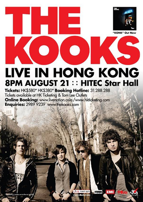
There are many graphical pieces I need to produce to give this band a noticeable identity. The most important element being a logo. The logo will need to be modern, unique and suited to the music genre which is a mixture between alternative, indie and dance. This logotype will be used in many situations so will have to be re-sized easily without any distortion and also quite simple so when the size is reduced the logo is still understandable. 

The second important thing to do is to plan and shoot my own photoshoot. I already have various ideas for this one of which being to find a urban location to give a modern 'grunge' style effect to the images. This will also create a suitable background for future design pieces. Photographs are the bases of many music designs so these images will be vital if I want my design to look professional.

There many other elements I plan to produce such as; Promotional flyers, posters, handouts, tickets, banners, a feature page in a magazine, album art and also additional merchandise such as key rings, t'shirts and stickers.